Chapter 12 Visualising results
The main results of a composite indicator are the aggregated scores and ranks. These can be explored and visualised in different ways, and the way you do this will depend on the context. For example, in building the index, it is useful to check the results at an initial stage, again after methodological adjustments, and so on through the construction process. Short static plots and tables are useful for concisely communicating results in reports or briefs.
When the index is complete, it can be presented using a dedicated web platform, which allows users to explore the results in depth. Some interesting examples of this include:
These latter platforms are not usually built in R, but in Javascript. However, COINr does have a simple interactive results viewer that can be used for prototyping.
12.1 Tables
To see the aggregated results, one way is to look in .$Data$Aggregated, which contains the aggregated scores, along with any grouping variables that were attached with the original data. However, this is not always convenient because the table can be quite large, and also the index itself will be the last column. You can of course manually select columns, but to make life easier COINr has a dedicated function, getResults().
library(COINr6)

# build example data set
ASEM <- build_ASEM() |>
  suppressMessages()

# get results table, top 10
getResults(ASEM) |>
  head(10)
##    UnitCode    UnitName Index Rank
## 1       CHE Switzerland 68.38    1
## 2       NLD Netherlands 64.82    2
## 3       DNK     Denmark 64.80    3
## 4       NOR      Norway 64.47    4
## 5       BEL     Belgium 63.54    5
## 6       SWE      Sweden 63.00    6
## 7       AUT     Austria 61.90    7
## 8       LUX  Luxembourg 61.58    8
## 9       DEU     Germany 60.75    9
## 10      MLT       Malta 60.36   10
By default, getResults() gives a table of the highest level of aggregation (i.e. typically the index), along with the scores, and the ranks. Scores are rounded to two decimal places, and this can be controlled by the nround argument. To see all aggregate scores, we can change the tab_type argument:
getResults(ASEM, tab_type = "Aggregates") |>
  reactable::reactable()
Here, we have used the reactable package to display the full table interactively. Notice that the aggregation levels are ordered from the highest level downwards, which is a more intuitive way to read the table. Other options for tab_type are “Full”, which shows all columns in .$Data$Aggregated (but rearranged to make them easier to read), and “FullWithDenoms”, which also attaches the denominators. These latter two are probably mostly useful for further data processing, or passing the results on to someone else.
Often it may be more interesting to look at ranks rather than scores We can do this by setting use = "ranks":
getResults(ASEM, tab_type = "Aggregates", use = "ranks") |>
  reactable::reactable()
Additionally to the getResults() function, the iplotTable() function also plots tables, but interactively (and indeed using the reactable package underneath). Like many other COINr functions it takes the isel and aglev arguments to select subsets of the indicator data. Moreover, it colours table cells, similar to conditional formatting in Excel.
As an example, we can request to see all the pillar scores inside the Connectivity sub-index. The function sorts the units by the first column by default. This function is useful for generating quick tables inside HTML reports.
iplotTable(ASEM, dset = "Aggregated", isel = "Conn", aglev = 2)Recall that since the output of this function is a reactable table, we can also edit it further by using reactable functions.
If you want a conditionally-formatted table like the one above, but of any data frame (e.g. the output of getResults()), use COINr’s colourTable() function which is a short cut for reactable tables, with a few options thrown in for which colours to use, sorting, and so on.
getResults(ASEM, tab_type = "Aggregates") |>
  head(10) |>
  colourTable(cell_colours = c("#99d594", "#ffffbf", "#fc8d59"), sortcol = "none")
For colouring, there are many websites to help select colours. Colourbrewer is one useful resource for maps and heatmaps.
If an individual unit is of interest, you can also call getUnitSummary(), which is a function which gives a summary of the scores for an individual unit:
getUnitSummary(ASEM, usel = "GBR", aglevs = c(4, 3, 2)) |>
knitr::kable()| Indicator | Score | Rank |
|---|---|---|
| Sustainable Connectivity | 57.76 | 15 |
| Connectivity | 52.81 | 14 |
| Sustainability | 62.72 | 14 |
| Physical | 51.75 | 10 |
| Economic and Financial (Con) | 21.17 | 32 |
| Political | 77.08 | 13 |
| Institutional | 76.61 | 15 |
| People to People | 37.44 | 20 |
| Environmental | 64.88 | 20 |
| Social | 73.10 | 10 |
| Economic and Financial (Sus) | 50.17 | 43 |
Finally, the strengths and weaknesses of an individual unit can be found by calling getStrengthNWeak():
SAW <- getStrengthNWeak(ASEM, usel = "GBR")
SAW$Strengths |> knitr::kable()| Code | Name | Dimension | Rank | Value | Unit |
|---|---|---|---|---|---|
| TIRcon | Signatory of TIR Convention | Instit | 1 | 1.00 | (1 (yes)/0 (no)) |
| Research | Research outputs with international collaborations | P2P | 1 | 96300.00 | Number |
| CultServ | Trade in cultural services | P2P | 1 | 9.57 | Million USD |
| Flights | International flights passenger capacity | Physical | 1 | 211.00 | Thousand seats |
| Embs | Embassies network | Political | 1 | 100.00 | Number |
SAW$Weaknesses |> knitr::kable()| Code | Name | Dimension | Rank | Value | Unit |
|---|---|---|---|---|---|
| TolMin | Tolerance for minorities | Social | 34 | 6.40 | Score |
| TBTs | Technical barriers to trade | Instit | 38 | 1190.00 | Number of measures (initiated, in force) |
| Renew | Renewable energy in total final energy consumption | Environ | 41 | 8.71 | Percent |
| PubDebt | Public debt as a percentage of GDP | SusEcFin | 41 | 89.00 | Percent |
| GDPGrow | GDP per capita growth | SusEcFin | 42 | 1.13 | Percent |
These are selected as the top-ranked and bottom-ranked indicators for each unit, respectively, where by default the top and bottom five are selected (but this can be changed using the topN and bottomN arguments).
12.2 Plots
Tables are useful but can be a bit dry, so you can spice this up using the bar chart and map options already mentioned in Initial visualisation and analysis.
iplotBar(ASEM, dset = "Aggregated", isel = "Index", usel = "GBR", aglev = 4)Even better, if we are plotting aggregated data we can also break down the bars into the underlying scores. For example, to see Sustainability scores with underlying sustainability pillar scores visible:
iplotBar(ASEM, dset = "Aggregated", isel = "Sust", aglev = 3, stack_children = TRUE)And here’s a map:
iplotMap(ASEM, dset = "Aggregated", isel = "Index")Remember that maps only work if both (a) your units are countries, and (b) you use ISO alpha-3 codes as unit codes.
The map and bar chart options here are very useful for quickly presenting results. However, if you want to make a really beautiful map, you should consider one of the many mapping packages in R, such as leaflet.
Apart from plotting individual indicators, we can inspect and compare unit scores using a radar chart. The function iplotRadar() allows the scores of one or more units, in a set of indicators, to be plotted on the same chart. It follows a similar syntax to iplotTable() and others, since it calls groups of indicators, so the isel and aglev arguments should be specified. Additionally, it requires a set of units to plot.
iplotRadar(ASEM, dset = "Aggregated", usel = c("CHN", "DEU"), isel = "Conn", aglev = 2)Radar charts, which look exciting to newbies, but have are often grumbled about by data-vis veterans, should be used in the right context. In the first place, they are mainly good for comparisons between units - if you simply want to see the scores of one unit, a bar chart may be a better choice because it is easier to see the scores and to compare scores between one indicator and another. Second, they are useful for a smallish number of indicators. A radar chart with two or three indicators looks silly, and with ten indicators or more is hard to read. The chart above, with five indicators, is a clear comparison between two countries (in my opinion), showing that one country scores higher in all dimensions of connectivity than another, and the relative differences.
The iplotRadar() function is powered by Plotly, therefore it can be edited using Plotly commands. It is an interactive graphic, so you can add and remove units by clicking on the legend.
A useful feature of this function is the possibility to easily add (group) means or medians. For example, we can add the a trace representing the overall median values for each indicator:
iplotRadar(ASEM, dset = "Aggregated", usel = c("CHN", "DEU"), isel = "Conn", aglev = 2, addstat = "median")We can also add the mean or median of a grouping variable that is present in the selected data set. Grouping variables are those that start with “Group_”. Here we can add the GDP group mean (both the selected countries are in the “XL” group).
iplotRadar(ASEM, dset = "Aggregated", usel = c("CHN", "DEU"), isel = "Conn", aglev = 2, addstat = "groupmean",
           statgroup = "Group_GDP", statgroup_name = "GDP")
12.3 Interactive exploration
COINr also offers a Shiny app called resultsDash() for quickly and interactively exploring the results. It features the plots described above, but in an interactive app format. The point of this is to give a tool which can be used to explore the results during development, and to demonstrate the results of the index in validation sessions with experts and stakeholders. It is not meant to replace a dedicated interactive platform. It could however be a starting point for a Shiny-based web platform.
To call the app, simply run:
resultsDash(ASEM)This will open a browser window or tab with the results dashboard app. The app allows you to select any of the data sets present in .$Data, and to plot any of the indicators inside either on a bar chart or map (see the toggle map/bar box in the bottom right corner). Units (i.e. countries here) can be compared by clicking on the bar chart or the map to select one or more countries - this plots them on the radar chart in the bottom left. The indicator groups plotted in the radar chart are selected by the “Aggregation level” and “Aggregation group” dropdowns. Finally, the “Table” tab switches to a table view, which uses the iplotTable() function mentioned above.
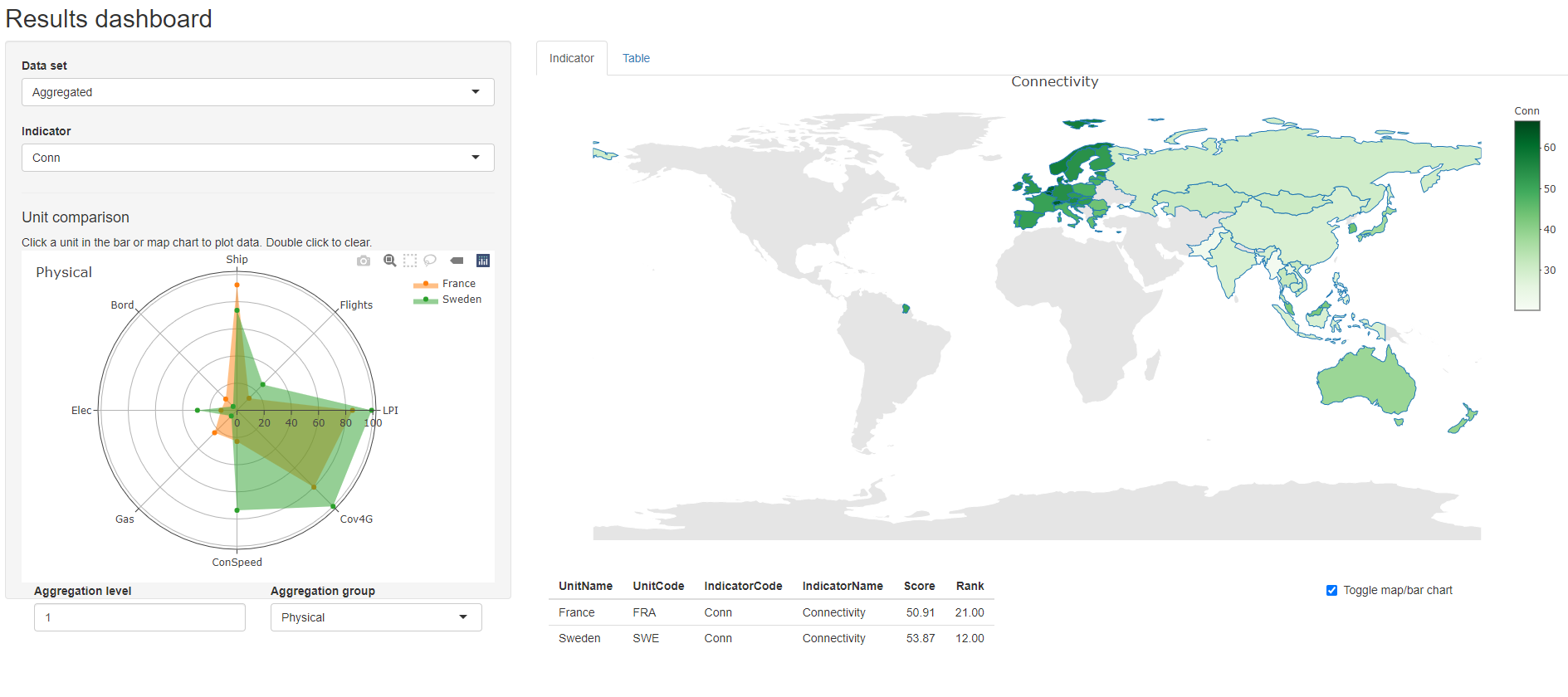
Figure 12.1: resultsDash screenshot
This app is useful for quickly visualising and presenting results. It might even be possible to host it online using shinyapps, although you might need the source code to do this. I am planning to enable online hosting more easily soon.
12.4 Unit reports
Many composite indicators produce reports for each unit, for example the “economy profiles” in the Global Innovation Index. Typically this is a summary of the scores and ranks of the unit, possibly some figures, and maybe strengths and weaknesses.
COINr allows country reports to be generated automatically. This is done via a parameterised R markdown document, which includes several of the tables and figures shown in this section4. The COINr function getUnitReport() generates a report for any specified unit using an example scorecard which is found in the /UnitReport directory where COINr is installed on your computer. To easily find this, call:
system.file("UnitReport", "unit_report_source.Rmd", package = "COINr")
## [1] "C:/R/RLib/COINr/UnitReport/unit_report_source.Rmd"
where the directory will be different on your computer.
Opening this document in R will give you an idea of how the parameterised document works. In short, the COIN object is passed into the R Markdown document, so that anything that is inside the COIN can be accessed and used for generating tables, figures and text. The example included is just that, an example. To see how it looks, we can run:
getUnitReport(ASEM, usel = "NZL", out_type = ".html")Calling this should create an html document in your current working directory, which will look something like this:
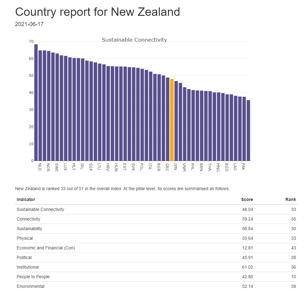
Figure 12.2: Unit profile screenshot 1/2
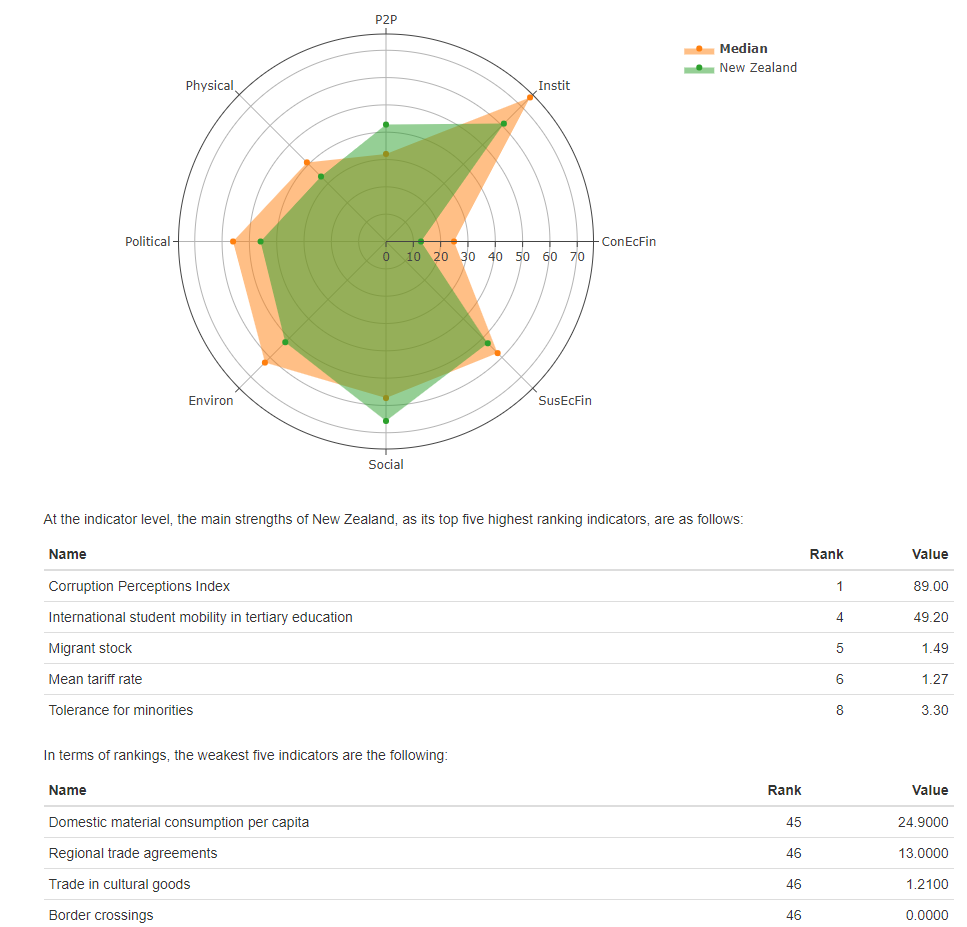
Figure 12.3: Unit profile screenshot 2/2
This is simply an example of the sort of thing that is possible, and the output can be either an html document, a Word document, or a pdf. It’s important to note that if the output is pdf or a Word doc, this is a static document which cannot include interactive plots such as those from plotly, COINr’s iplot functions and any other javascript or html widget figures. If you want to use interactive plots, but still be able to create static documents, you must install the webshot package. To do this, run:
install.packages("webshot")
webshot::install_phantomjs()
This will effectively render the figures to html, then take a static snapshot of each figure and paste it into your static document. Of course, this loses the interactive element of these plots, but can still render nice plots depending on what you are doing. If you do not have webshot installed, and try to render interactive plots to pdf or docx, you will encounter an error.
That aside, why use a parameterised document, rather than a normal R Markdown doc? Because by parameterising it, we can automatically create unit profiles for all units at once, or a subset, by inserting the relevant unit codes:
getUnitReport(ASEM, usel = c("AUS", "AUT", "CHN"), out_type = ".html"))This generates reports for the three countries specified, but of course you can do it for all units present if you want to.
Most likely if you want to use this function you will want to create a customised template that fits your requirements. To do this, copy the existing template found in the COINr directory as described above. Then make your own modifications, and set the rmd_template argument to point to the new template. If the output is a Word doc, you can also customise the formatting of the document by additionally including a Word template. To do this, see the R Markdown Guide. In fact, browsing this book is probably a good idea in general if you are planning to generate many unit reports or other markdown reports. You many also wish to create your own function for rendering rather than using getUnitReport(). The code for this function can be found on Github and this may help for inspiration.